UX/UI FUBAR
I’m CONSTANTLY encountering site designs “in the wild” that clearly don’t take the user into account. Rather than shaking my fist at the sky and screaming into the void, I’m going to start documenting them here. Let’s get started!
August 17, 2023
AllMusic Doesn’t Really Want You To Subscribe, Apparently
A lot of the businesses I work with assume their home page is always the first page on their site that people will see.
In reality, the majority of organic traffic is normally coming to internal pages. So even if it’s bottom-funnel content, don’t forget that some users are coming to these internal pages without knowing much about you or your brand.
Still. the information presented there needs to be extremely quick into the point.
Here’s a good one:
This example from Allmusic that isn’t particularly egregious, but it illustrates a point I want to make.
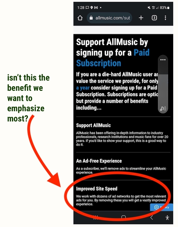
So the value prop here is that you can support AllMusic by signing up
for a paid subscription. The page assumes that the user already knows about and loves the service; however, I entered the site through this page.
So I had no idea what they were asking me to support.
But the main point here is this: “Subscriptions are optional, but provide a number of benefits including…” but then those benefits are listed in the wrong order.
The first one is about “feeling good.” The second is about getting an ad-free experience, which I imagine many of their users doing care about.
I would move the last point about faster page slow times to the very top and emphasize that. You are trying to appeal to their good hearts and good natures, but in a world where your users can get music streams somewhere else, AllMusic really needs to think about putting their unique value proposition front and center.
As always, hit me up if you have any suggestions about UX/UI as it relates to content marketing, SEO and digital PR. Just put “UX/UI” in the field that says “Tell me about your business and your goals.”